The absurdity of the use of kph

Image
  First and foremost I apologise (yet again) for such a long gap in between blog posts. The return of freedom over the past year has kept me away from screens. They say it takes 66 days to develop a new habit. Running is a habit I developed over lockdown, but the return to the office (and I intend to never work from home again) and frequenting the pub has reduced frequency of this.  It is, however, not completely bleak for my physical well-being. Cramming a number of social events in after work has led to me doing a lot more walking around central London. I don’t have an Apple Watch, (other brands of smart watch exist), but my iPhone records my steps and a lot of really interesting data on my walking and running. As would be no surprise, I’ve configured everything in metric units. Thankfully, gone are the days where Apple would dictate to you , based on your location, the units of measurement you use. You have a chose whether to specify distances in miles or kilometres....
How much detail is too much?

In many facets of life, clarity is key. Relationships, situationships, or anything in-between usually work better when there is clarity. Everyone knows where they stand. What makes these things work better is when the rules only go as far as they need to and no further. 

It's much the same with signage. Nobody wants a sign with too much detail. A fundamental rule of clarity is to say what you want to say in as few words as possible. Imagine going to a bar or restaurant and having these two options for signs:
  1. Toilets ➝
  2. Toilets straight ahead. Men's toilets at the first door, women's toilets at the second door. 
While the second one gives more detail, the first one tells you enough and can be processed more quickly. The first one is all you need and therefore more efficient.

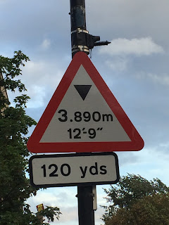
The same goes for road signs. Particularly the example below: 


First and foremost, I'm glad it's a sign that shows the height restriction in metres, and gives metres priority over feet and inches, there are a few problems with this sign. Firstly triangular hazard signs, should show only one set of units. The metric units and imperial units should therefore be on two separate signs. There's also the added confusion of yards at the bottom. But I won't dwell on those just now. 

The main issue with this sign is the level of detail. It would be much clearer if it simply said "3.9 m". I would even forgive the rounding if it said "3.8 m". There is little to no value of having a sign saying "3.980 m". Much like toilet sign 2, it tells you more than you need to know. Save that for the people building the bridge. 


Comments

Popular posts from this blog

the stupidity of the AA

Fuel consumption/ fuel effinciency